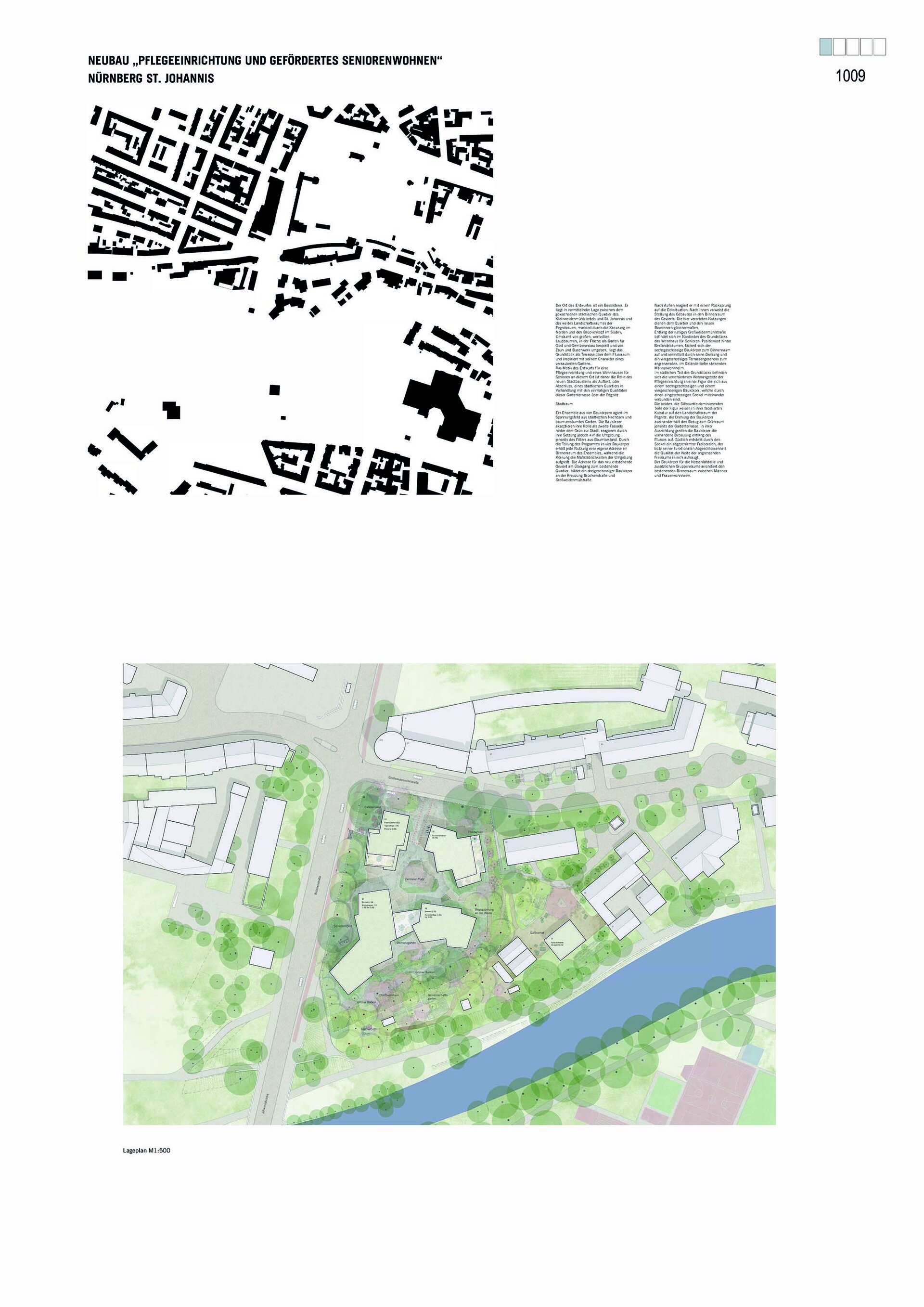
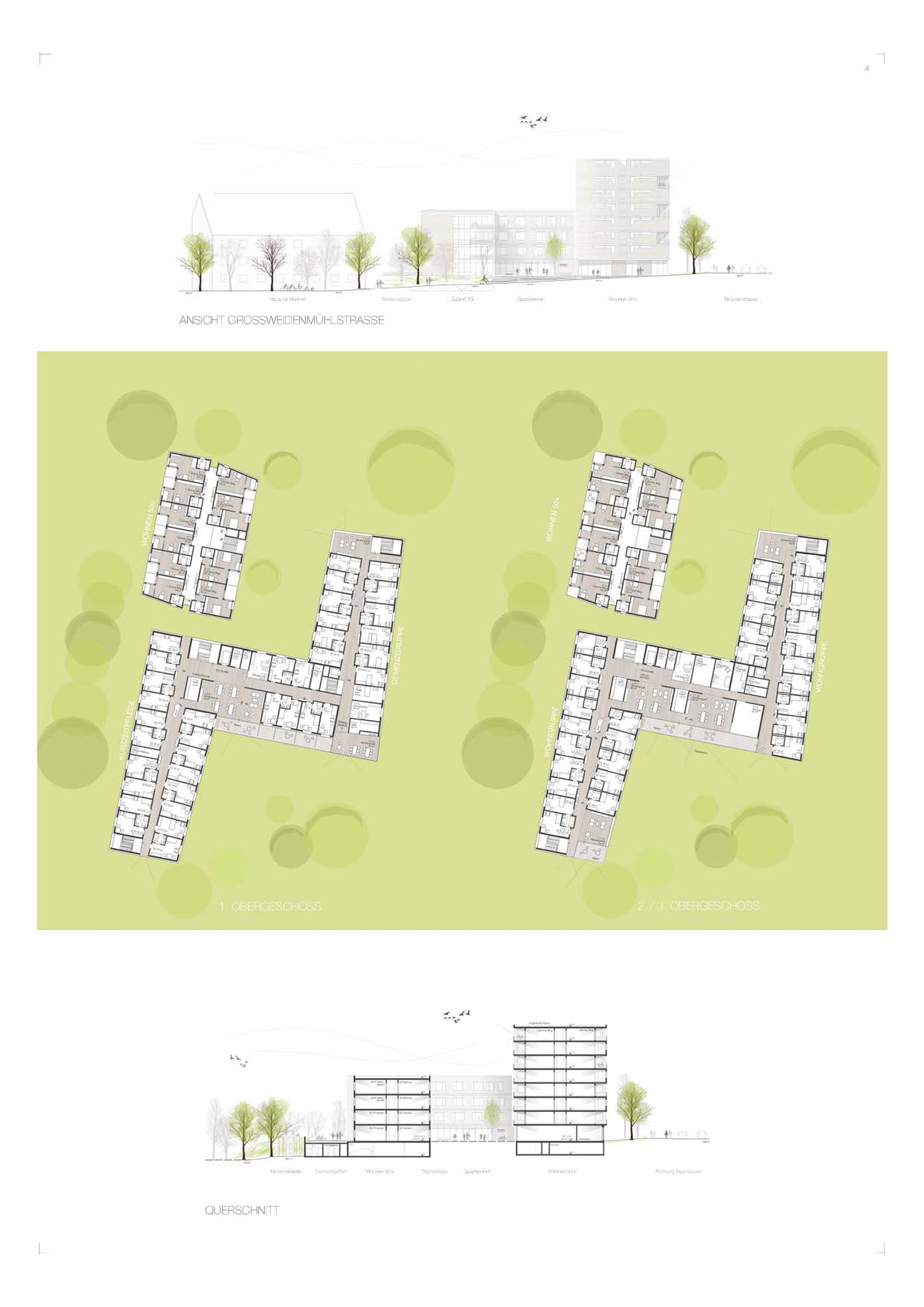
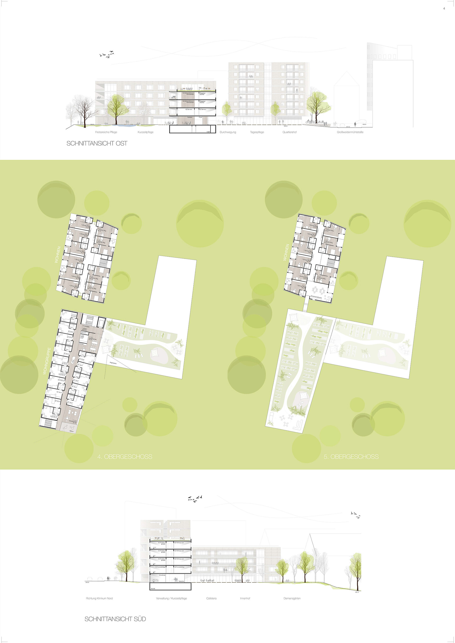
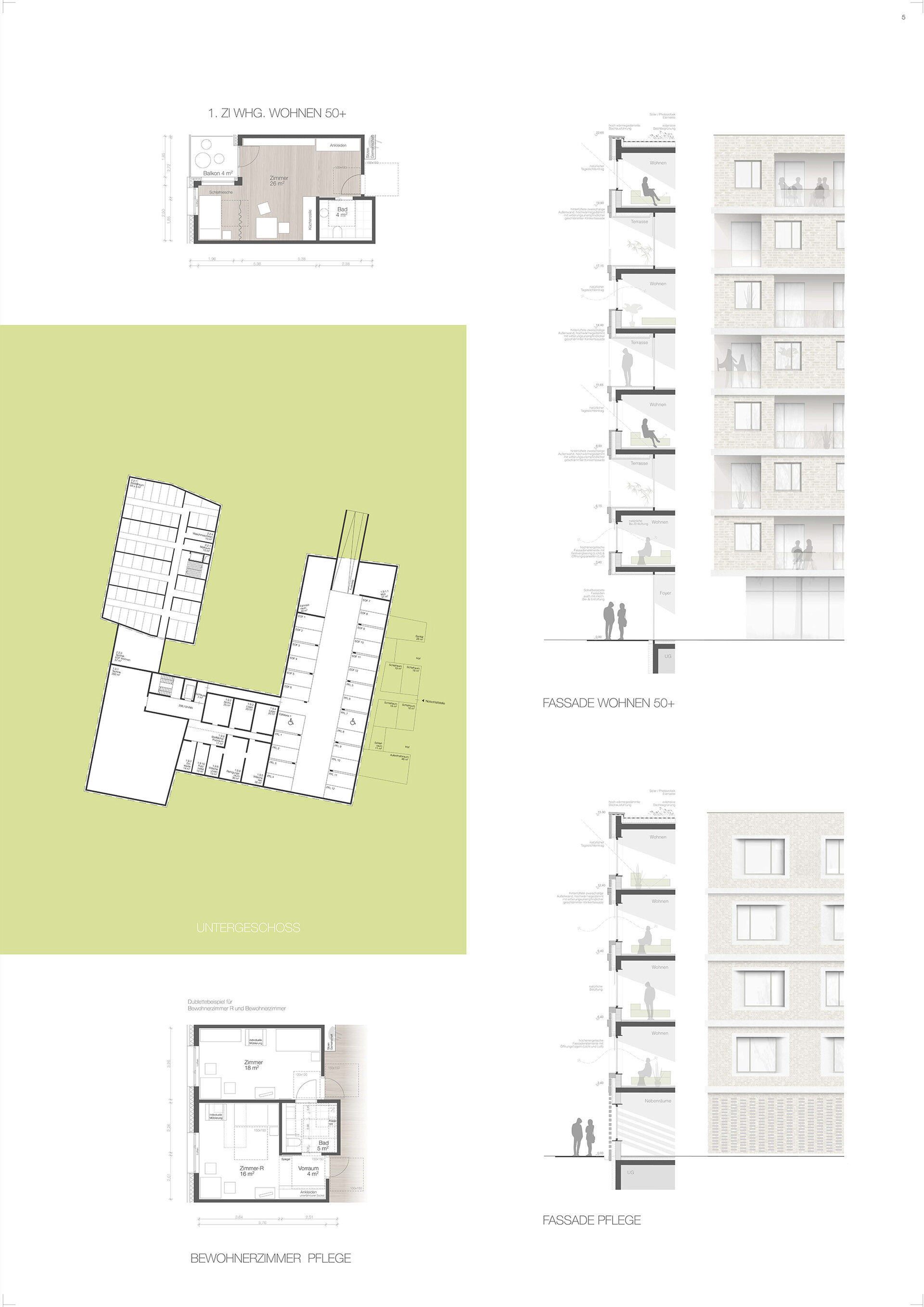
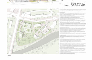
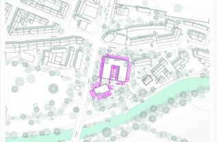
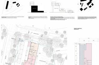
wbg Nürnberg intends to develop a site currently used for a garden in the St. Johannis district in the west of Nürnberg. The approx. 5,900 m2 site is located in the immediate vicinity of Pegnitzgrund and borders Brückenstraße and Großweidenmühlstraße. The plan is to build a nursing home and subsidised flats for senior citizens with the associated parking spaces in accordance with the parking space regulations of the City of Nuremberg.
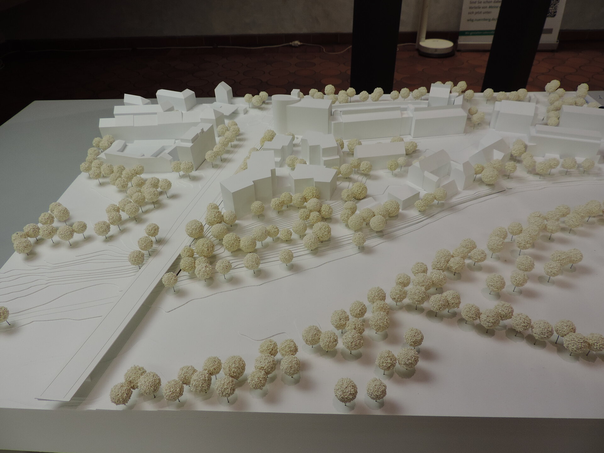
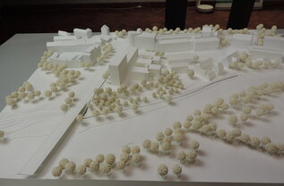
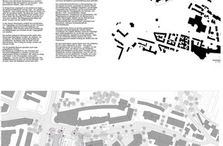
From an urban development perspective, the development of the site is intended to form the southern edge of the district towards the Pegnitz floodplain, but also to ensure a good connection between the district and the recreational areas in Pegnitzgrund and the paths there for pedestrians and cyclists. The division and placement of the building mass is the task of the competition. The competition entries are shown below. Click on the picture galleries to see the pictures in full size.
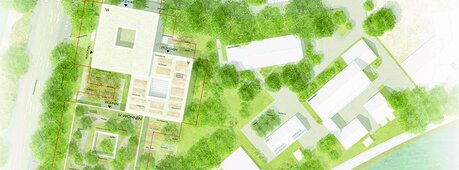
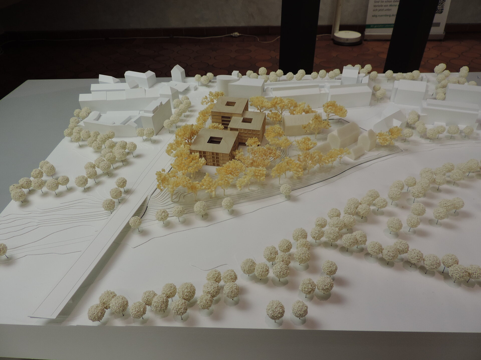
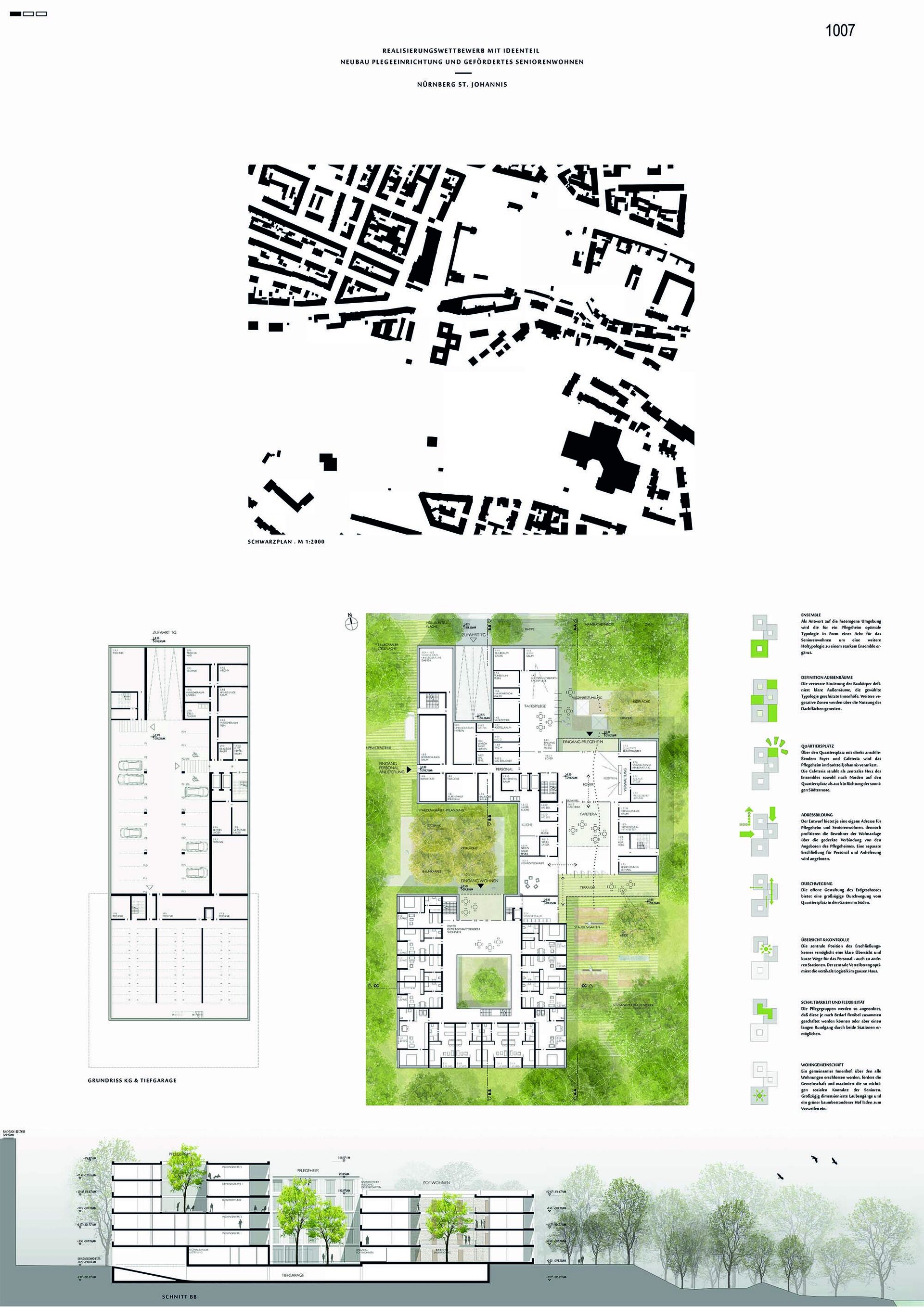
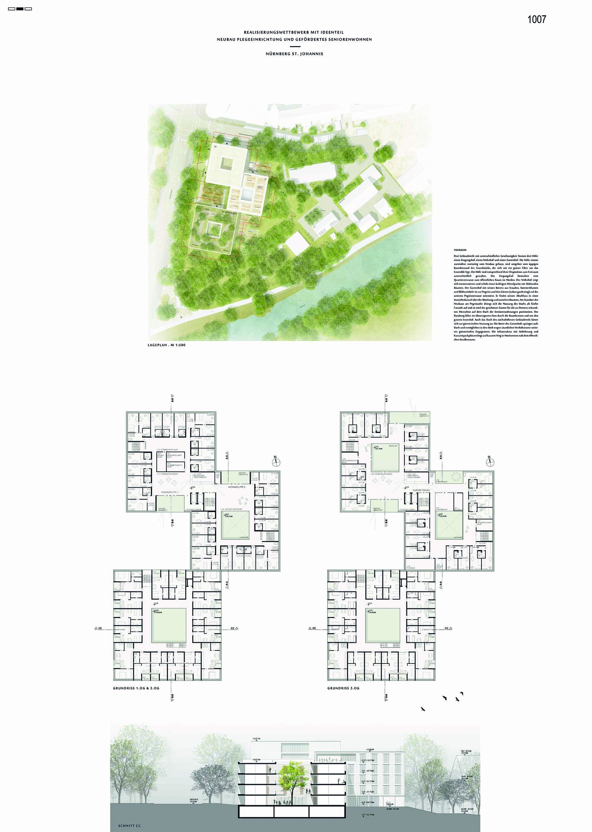
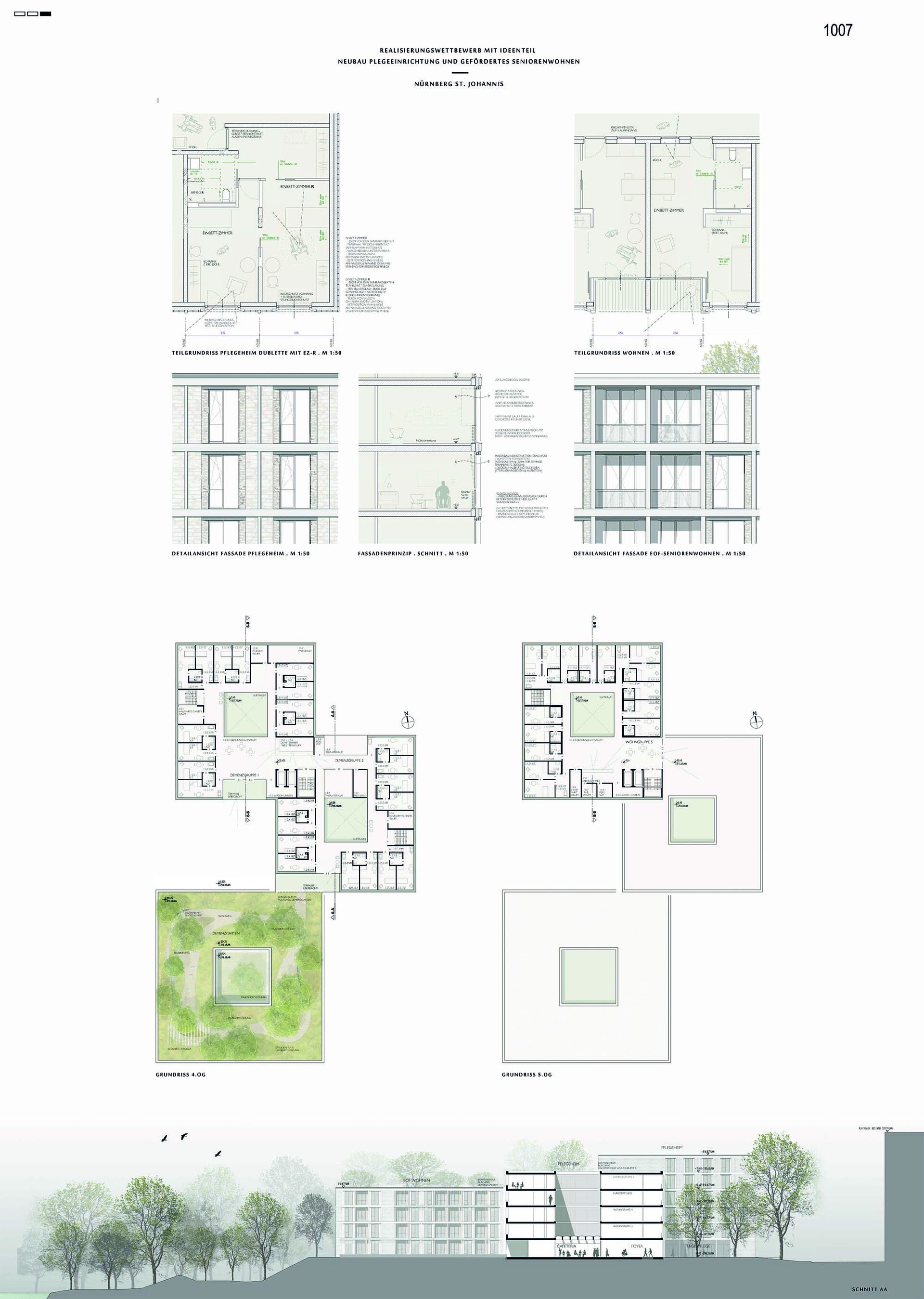
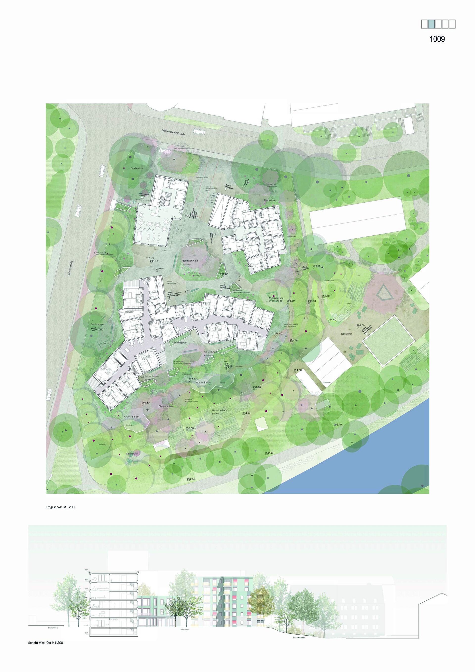
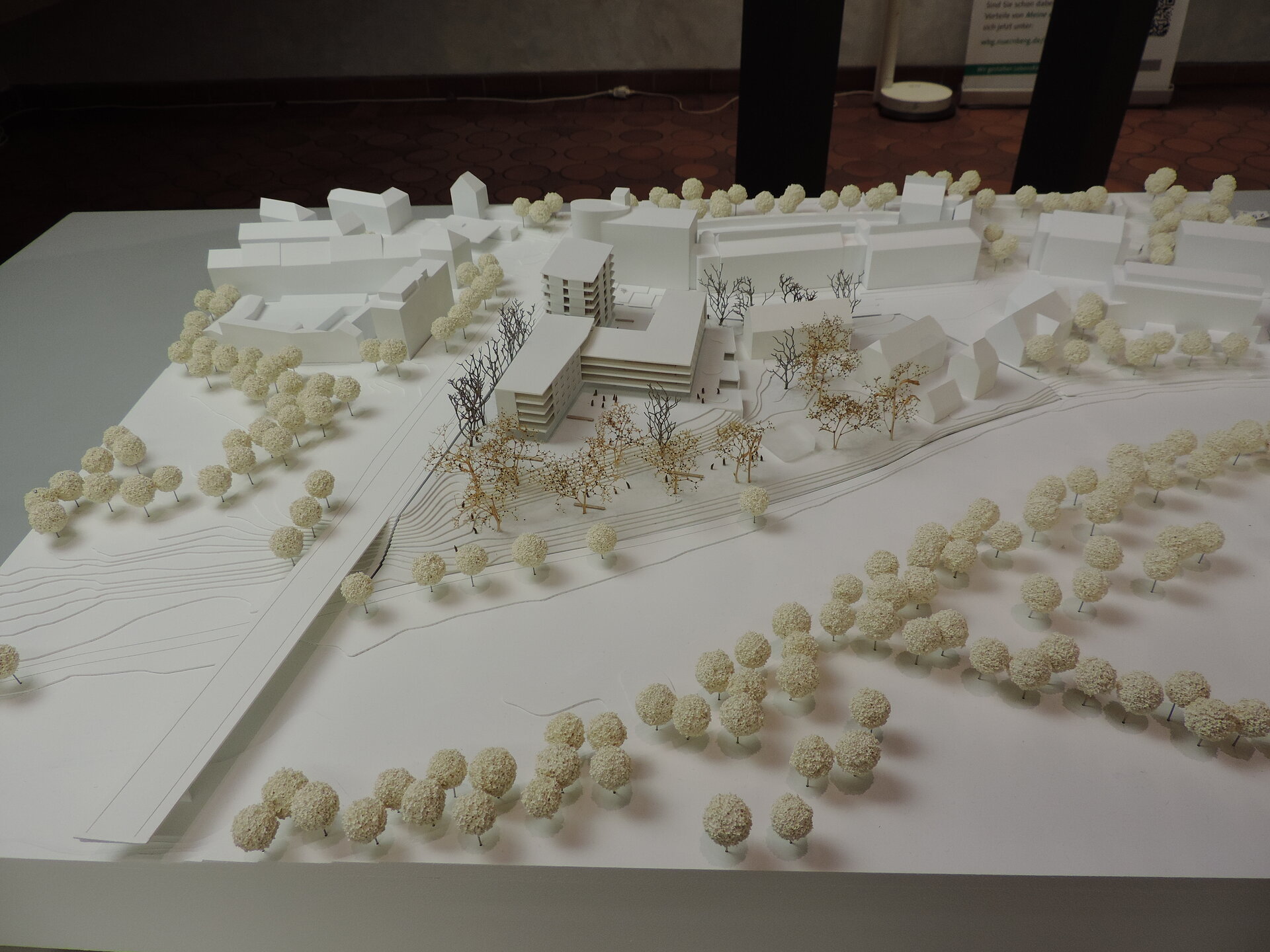
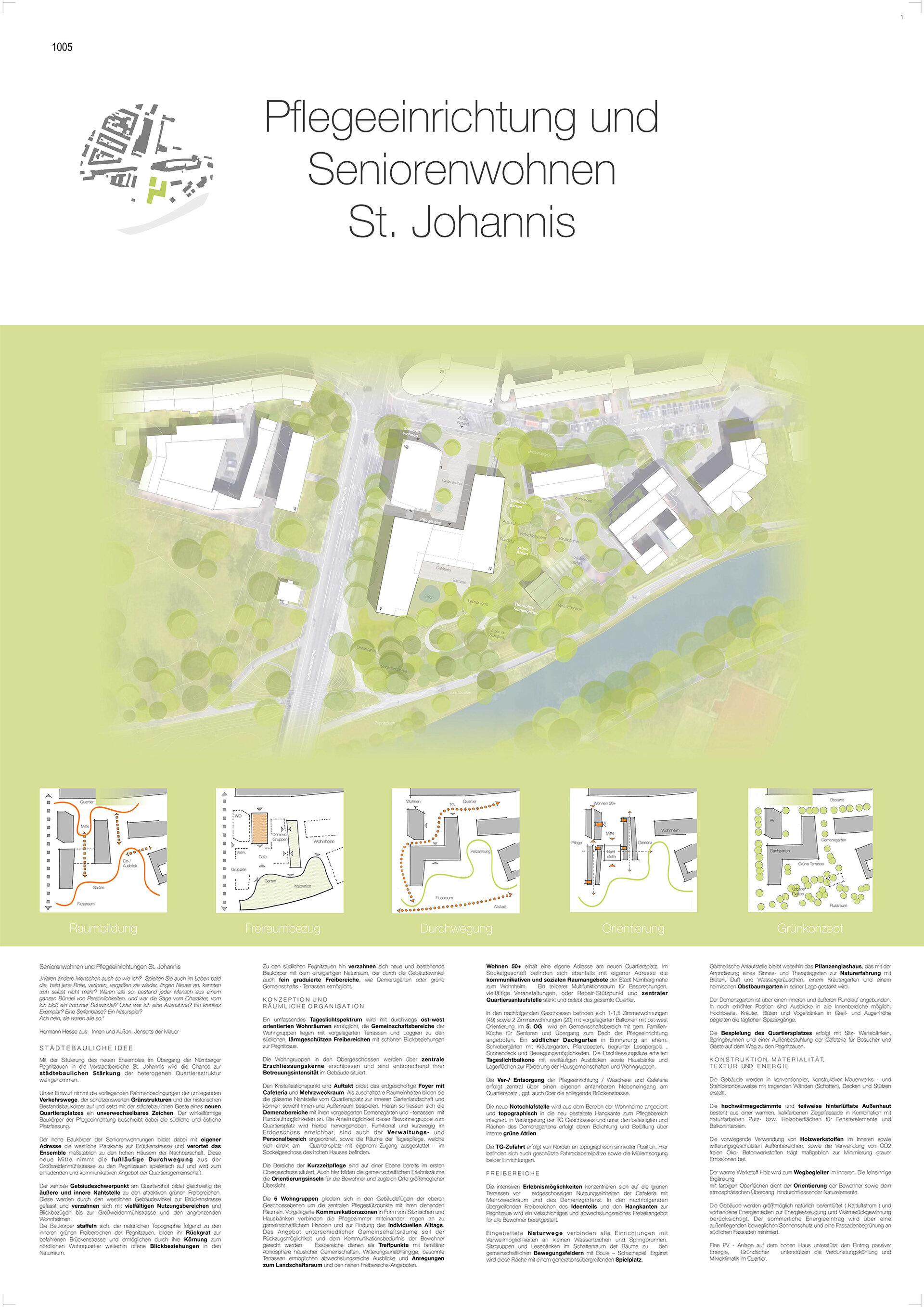
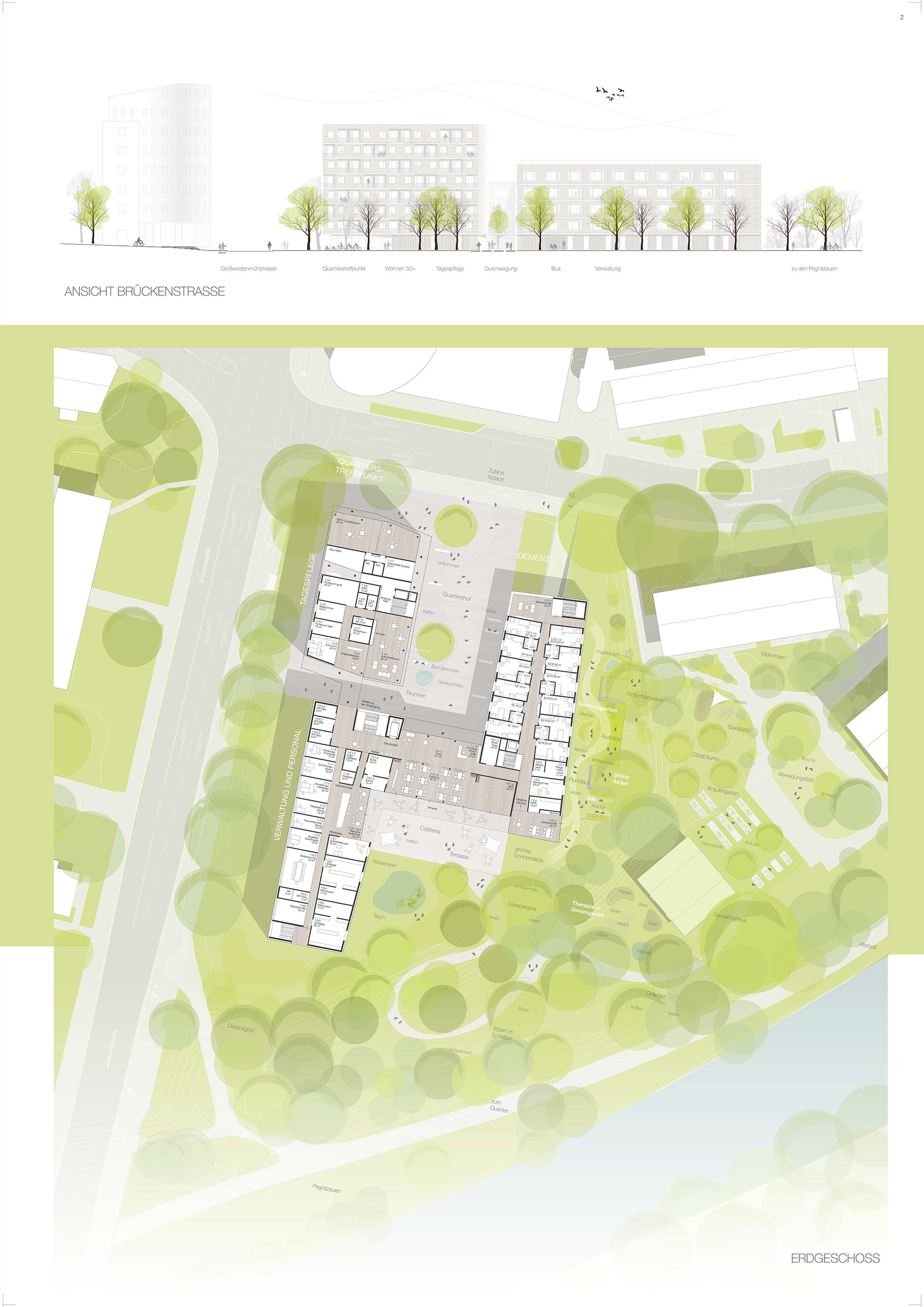
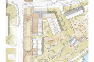
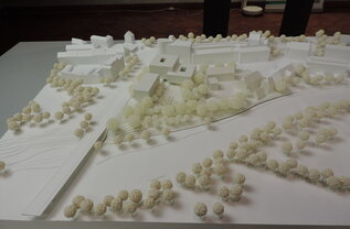
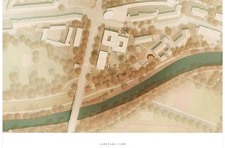
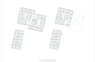
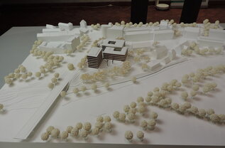
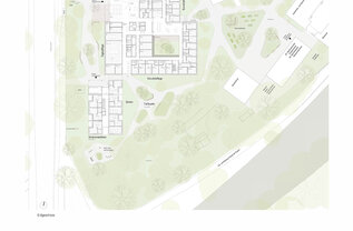
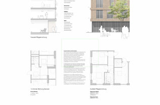
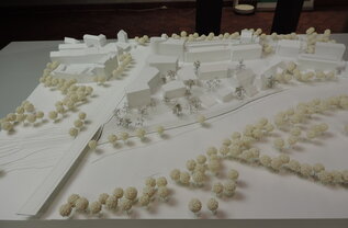
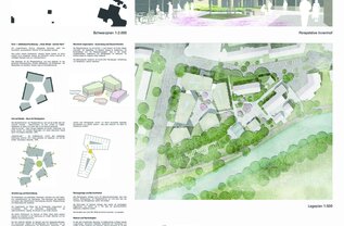
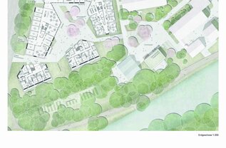
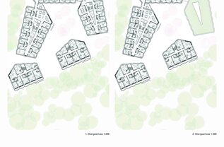
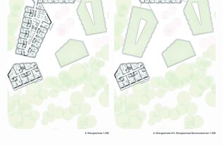
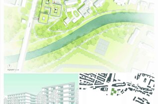
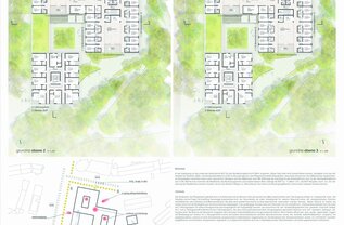
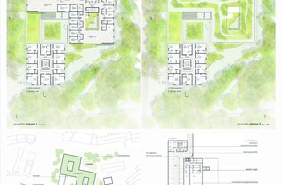
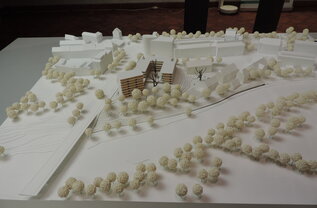
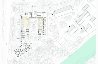
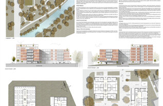
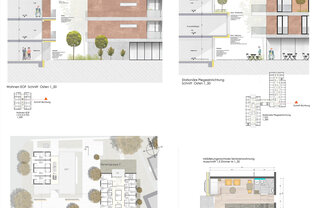
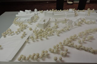
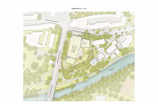
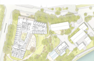
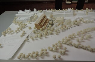
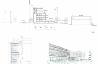
Like three pavilions in the park on the Pegnitz floodplain, the buildings are oriented along Brückenstraße and stagger pleasantly from the Pegnitz up to Großweidenmühlstraße. The valuable bioclimatic trees and shrubs on the southern slope remain largely untouched. A number of external and internal courtyards and atriums interlock the building structures with the landscape, creating pleasant transitions. The roof greening of the southern building structure and its use as a garden for dementia patients support this design idea.
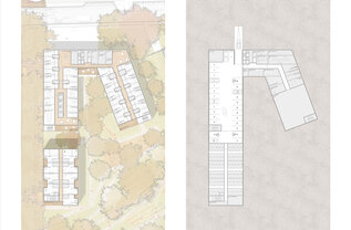
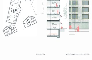
The central development is set off from the intersection area and is functionally correct. This area opens up well to the Pegnitz floodplain via the cafeteria. The access to the flats is somewhat hidden in the courtyard facing west. A little more clarity could be created here, for example through the design of the courtyard, especially since the tree plantings shown in the square clash with the underground car park below. In addition, a direct ground-level connection to the park would be desirable.
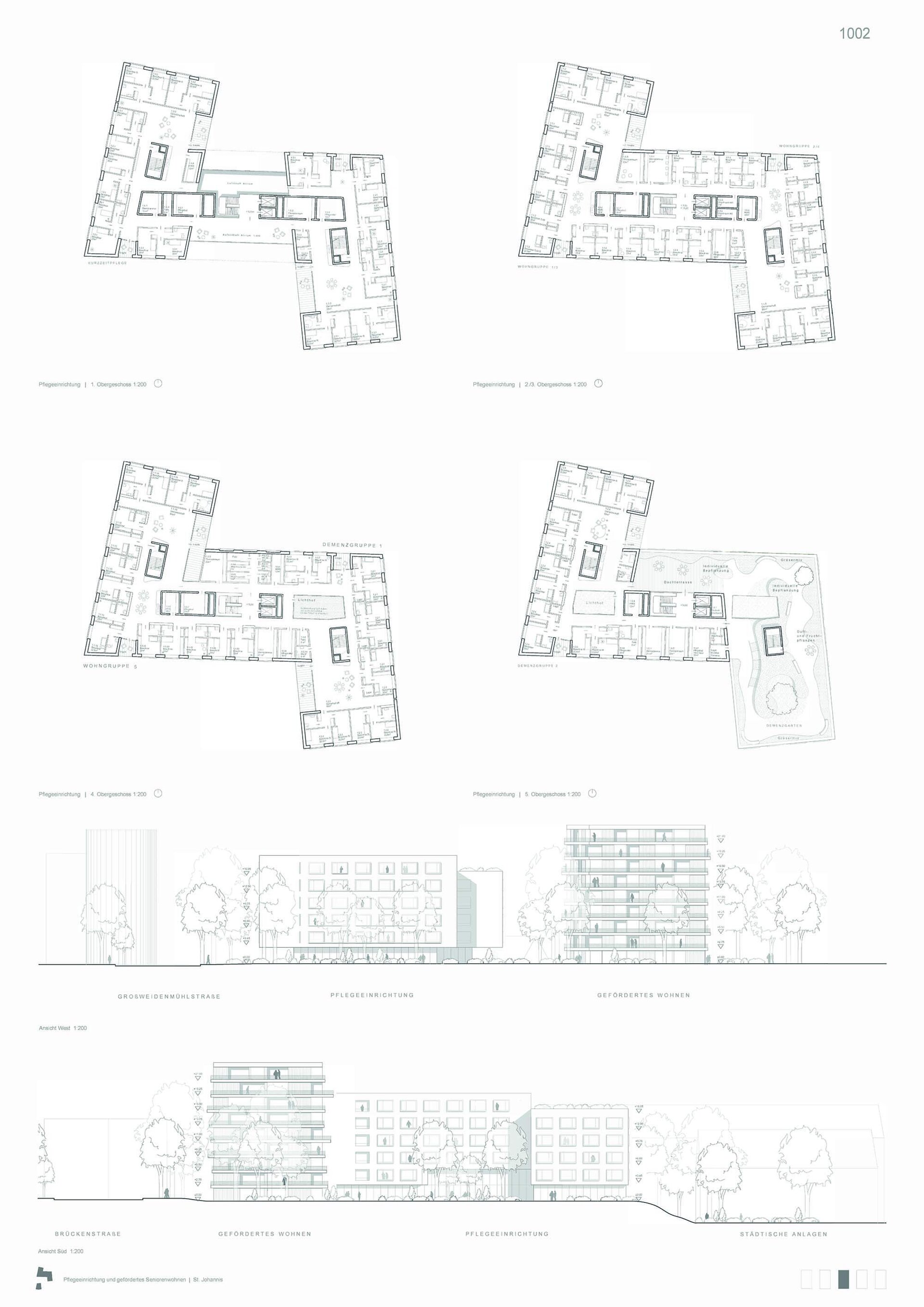
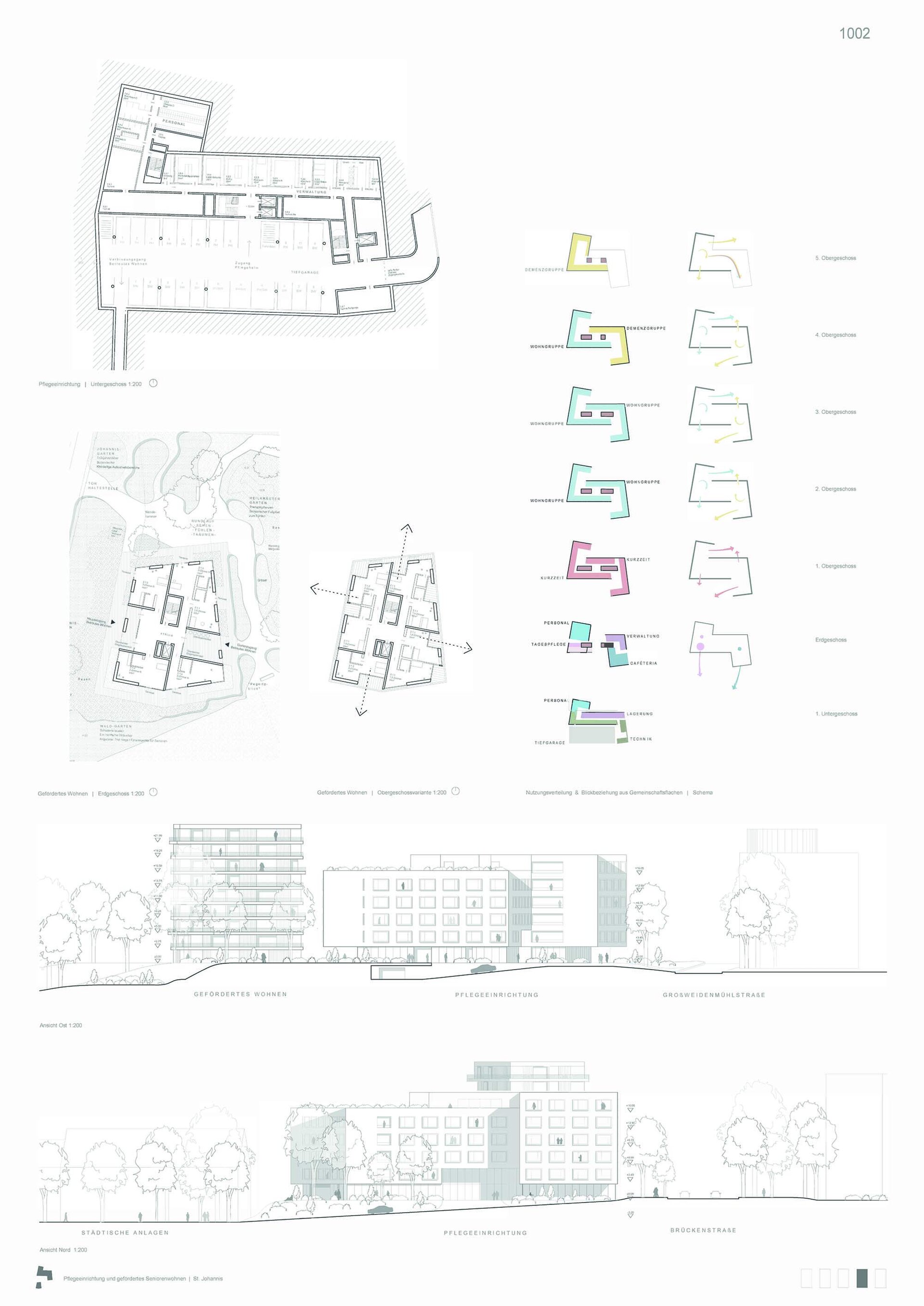
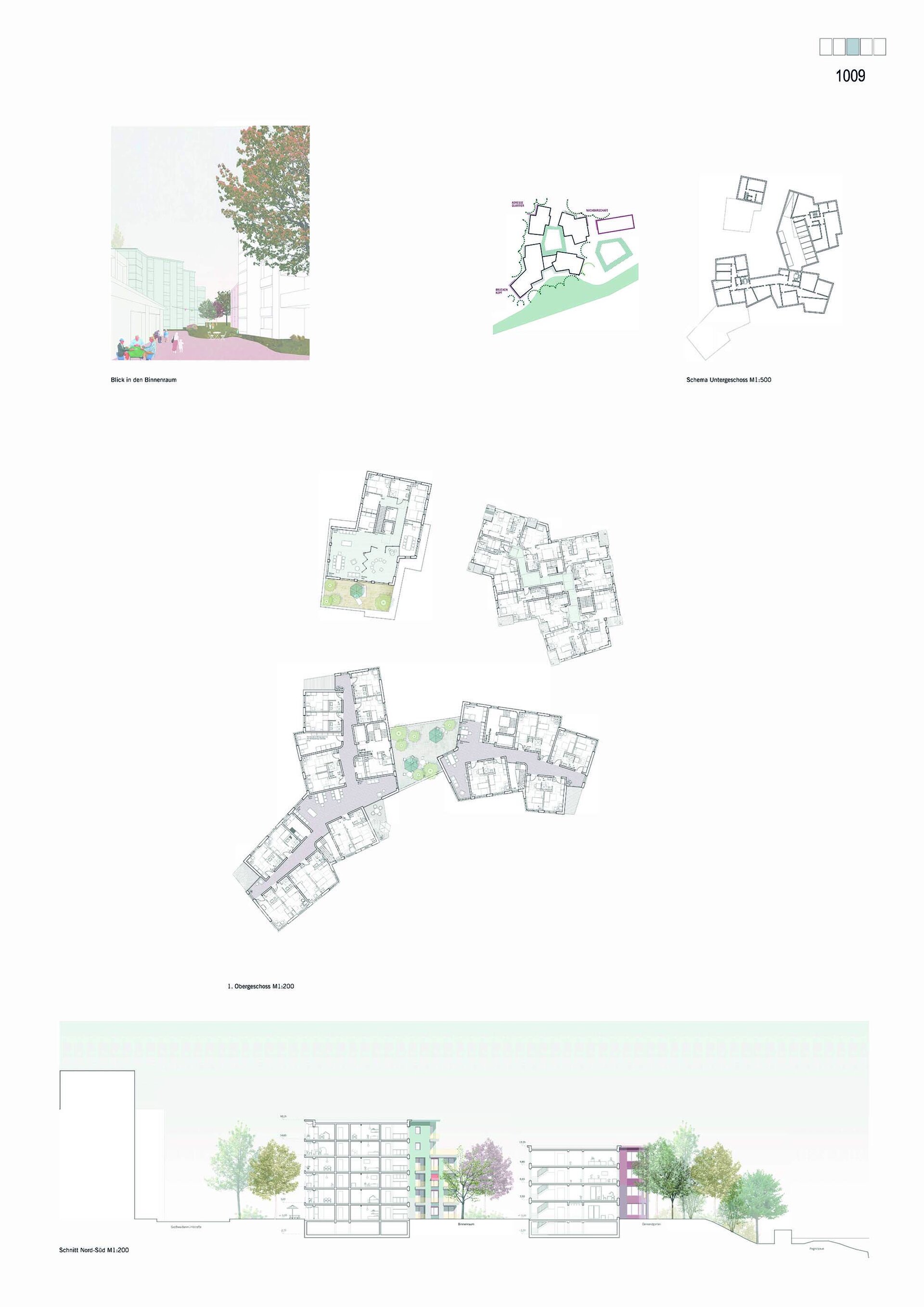
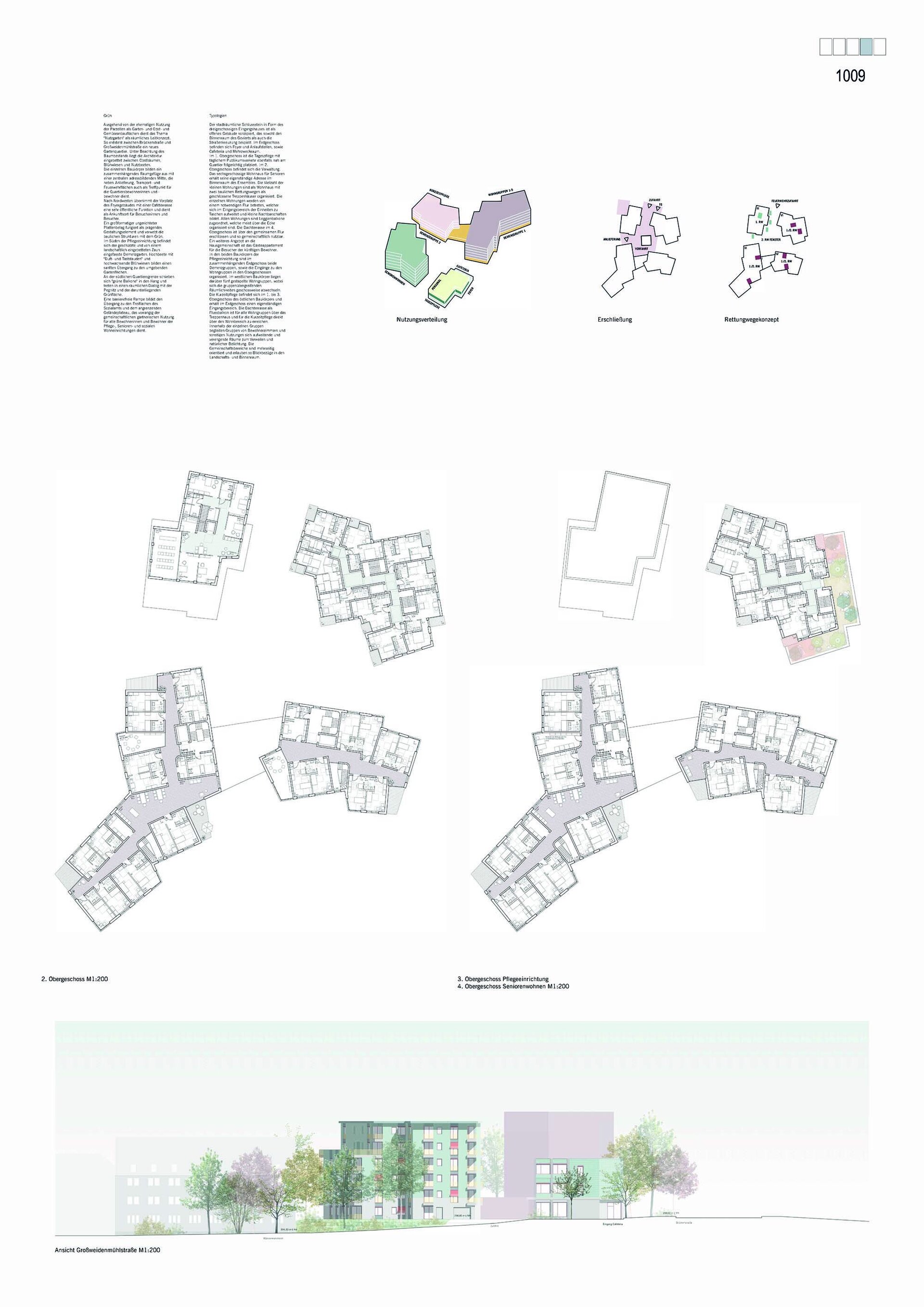
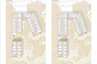
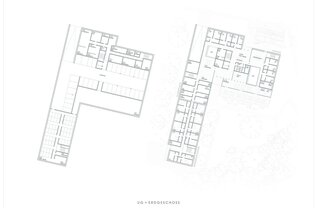
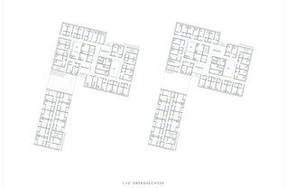
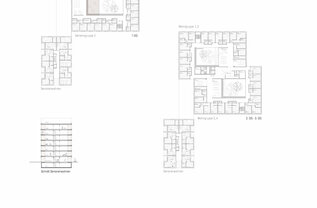
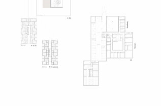
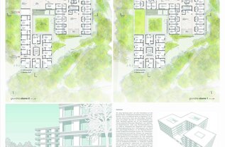
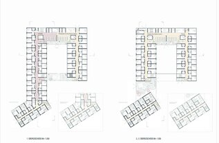
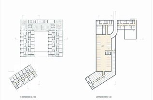
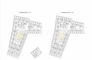
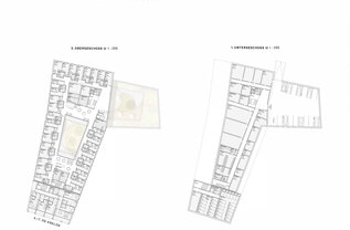
With the northern building structure, the architects overstep the construction area in favour of building over the access to the underground car park located there. The proposed typology of the horizontal “eight” for the building structures of the nursing home demonstrates the possibility of circular corridors in the dementia groups. Widenings in the corridors make it possible for people to pass each other. The door width does not meet the requirements with active and fixed leaves.
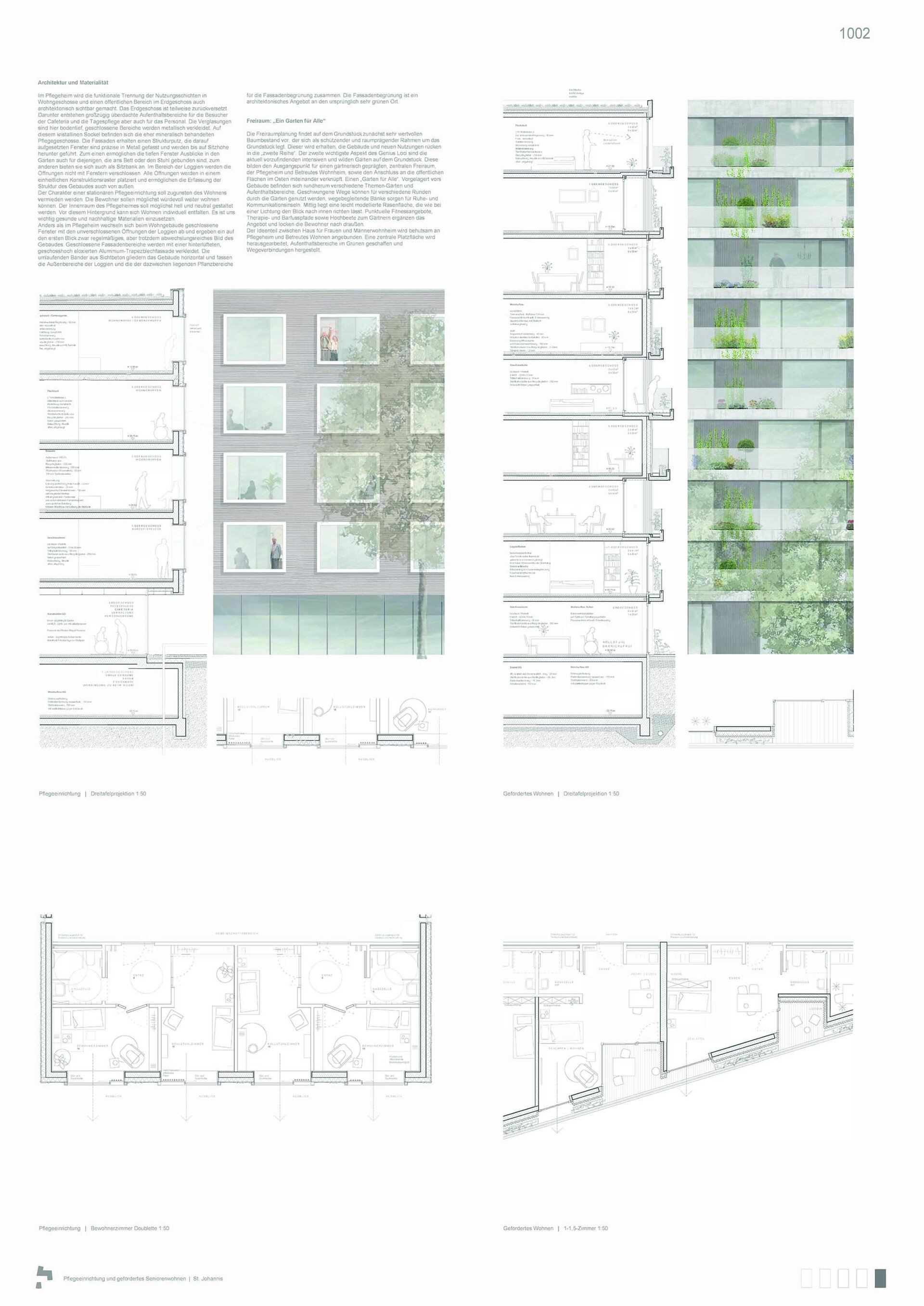
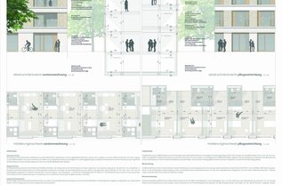
The design of the doublets and separate sanitary area and anteroom is considered positive. The access to the senior citizens’ flats via an open, outdoor atrium is conceivable, but the necessity of windbreaks in the residential units would have to be examined. Independent living is impressively underscored by this.
Open spaces: The well-proportioned extroverted courtyards form appealing, separate entrance zones to the care and residential areas. Unfortunately, the front area of the care facility is somewhat hidden in a recessed north-east corner of the complex, while the underground car park exit, refuse storage area/delivery area and adjoining rooms are arranged towards the street. The continuity of the eastern building structure into the floodplain green space is welcome. There are attractive usable open spaces for the nursing home users and visitors. The garden for dementia patients is secluded on the southern roof area according to the requirements and is an attractive addition to the ground-floor open spaces. The underbuilt tree locations shown in floor plans and sections without any substrate layers are misleading.
Overall, the design is a compelling and successful example of combining senior living and a nursing home in this landscape-sensitive location in the Pegnitz floodplain.
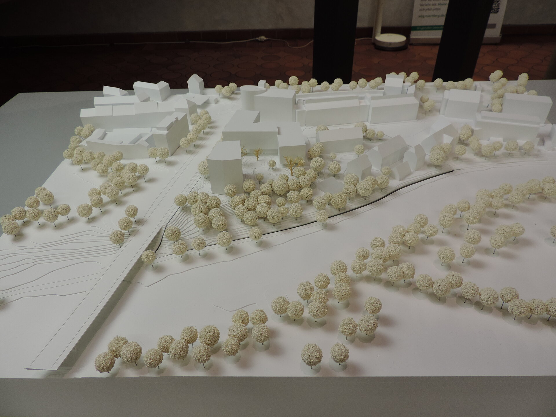
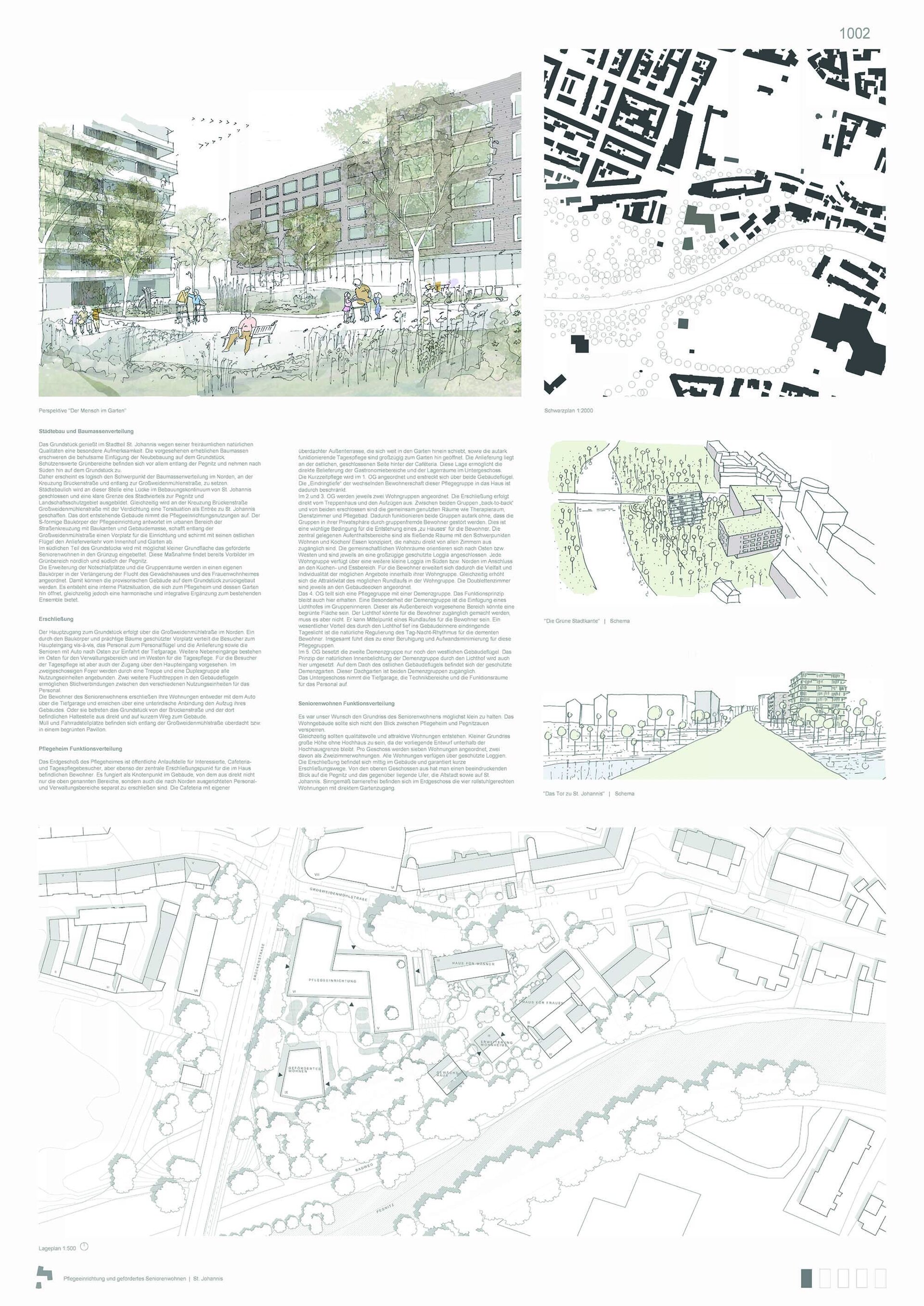
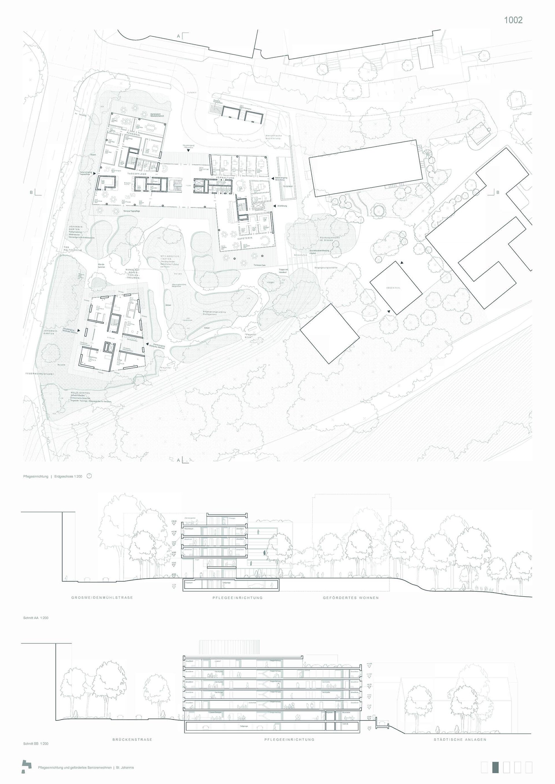
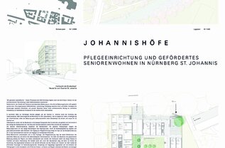
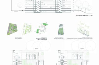
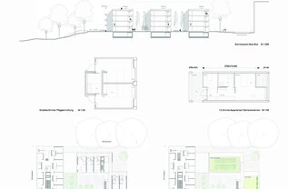
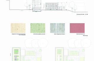
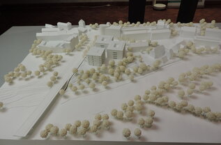
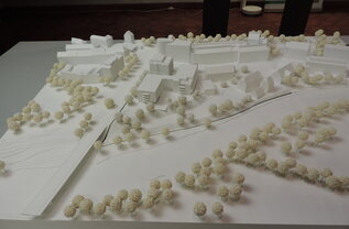
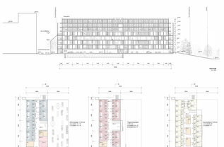
The architects have essentially divided the site into two construction areas. In the north, two interlocking L-brackets form a Z-shape and house the care facility here; in the south, on the edge of the embankment facing the open space of the Pegnitz, a nine-storey, polygonally shaped high point with the subsidised flats. In between, there is a park-like green space that is meant to accommodate various functions.
The proposal may initially come as a surprise, as one would expect one more high point in the Brückenstraße / Großweidenmühlstraße intersection. On closer inspection, however, the building structures are very carefully placed in terms of urban space. The heights of the buildings and their edges, defined by urban development, reflect the surroundings; the high point with its modest footprint on Brückenstraße accentuates the beginning of the St. Johannis district without closing off the landscape with large, incongruous forms. The proposed distribution of ground floor utilisation should be able to facilitate a desired link with the surrounding district. Only the routing of the underground car park access road in front of the main entrance to the nursing home gives cause for criticism.
Despite a high proportion of development space, especially on the ground floor - which is intended as a lounge and meeting area - the three-floor layout is compact, manageable and allows for an economical construction and operation, although some details, such as the division of the area for dementia patients into two floors, are called into question and need to be reworked.
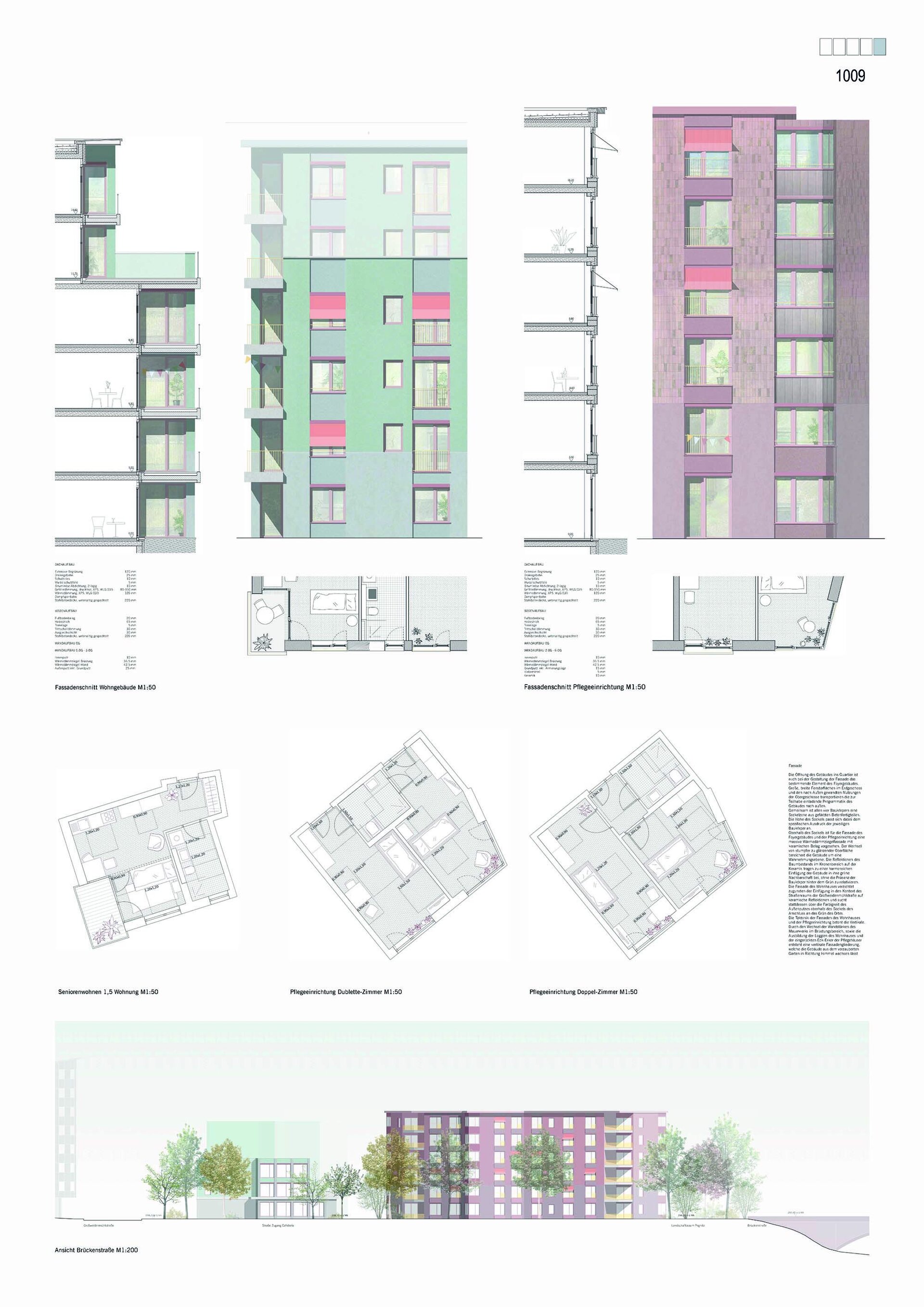
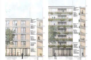
Fortunately, the roof areas are included in the utilisation concept, and the proposals for greening the façade are also applauded, although they would certainly need to be worked out in detail. The differentiation into two façade principles is convincing. The façades of the residential building are formed by an open and greened balcony and loggia layer. The care facility will have a generous perforated façade, which will allow for a variety of interactions with the outside.
Open spaces: The architects confidently place the new ensemble in the second row with due regard for the tree population that is worth preserving. Not only because of this, but also because of the low site occupancy ratio, the atmosphere of the green riverside slope can be continued through the site, in which the new high point is attractively situated as a “garden house”. In return, the square facing the city in the north must remain narrow and also accommodate all the logistical functions of delivery and access. This is viewed critically on the one hand, also with respect to the ancillary facilities in the root protection area. On the other hand, it is cleverly compensated for by the fact that the building is very permeable at this point and thus leads into the southern floodplain space. The spacious garden courtyard located there can combine the open space requirements of the nursing and residential facilities well; consequently, there is a separate garden for the dementia groups on the roof areas of the 5th floor. The continuation of the green spaces to the east to the municipal facilities is well solved and is enriched by an extensive seating area. In this way, the architects have not only achieved a good quality of open space for the users, but also a good open space network and, therefore, anchoring in the district.
With its independent urban development, the project makes a valuable contribution to solving the task and, despite some weaknesses, is convincing in its entirety.
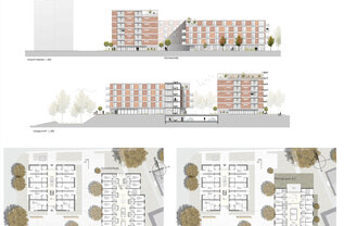
In terms of urban development, the work very skilfully interprets the transition from the dense urban district to the garden area in the floodplain. The moderately staggered ensemble of four related building structures is deliberately set back behind the green space. Despite its emphatically loose composition as a cluster, a clear central open space is created from which all four houses can be accessed, as if from a village square. The building structure on the street corner opens up to the district with a cafeteria, but its special low-profile role there does not meet with unanimous approval.
In the architectural development, the architects succeed excellently in achieving an inviting, small-scale impression that is conducive to the garden plot. The open spaces are structured in a varied way; an attractive garden for residents with dementia is well placed in the south on the green embankment zone facing the floodplain. The concept of mixed spaces fits well with the loose cluster, but it would need some clarification in detail (including the entrance to the underground car park). The proposed active garden utilisation in the protected southern tree area leads to extensive encroachment and is not convincing there. The arrangement of the care areas is well done, but the division into three houses goes hand in hand with increased constructional and operational effort. The individual residential floor plans with their moving, differentiated development spaces are also appreciated. However, there are clearly too few units.
A clear deficit is also noted in the area of parking spaces. The presumably high construction costs and the comparatively high proportion of external walls are also criticised. Otherwise, the work is in the good average range in terms of area and mass characteristics. The construction is conventional, and the façades exhibit attractive echoes of simple, colourfully decorative architecture of the post-war period.
Open spaces: With the placement and shaping of the façades facing the district, the architects propagate the continuation of the green border. This noticeable reminiscence of the existing gardens and the associated pleasant quality of stay within the small-scale structures are judged to be successful. The openings on all sides into the district and to the floodplain or the municipal facilities connect the well-proportioned inner courtyard in a natural and inviting way. The garden for dementia patients is located separately and attractively on a south-facing terrace facing the riverbank. The logistical requirements, including the entrance to the underground car park, are well integrated into the continuous square and courtyard spaces without counteracting the address generation of the individual building blocks. Smaller roof sections are offered to the adjacent residents of the upper floors at the same level, enriching the available open space. Overall, the work is considered to be very sensible in terms of urban development and landscape. It develops the nursing and residential home as an inviting ensemble of individual houses in a green setting. However, the ambitious composition and design lead the jury to doubt the operational and economic feasibility and appropriateness.
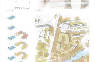
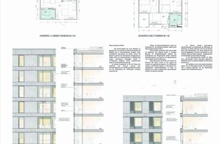
The architects propose a Z-shaped building structure with a residential urban development high point directly at the intersection of Großweidenmühlstraße and Brückenstraße. The arrangement of the nursing home and the multi-storey residential point define an inviting district courtyard that opens up to Großweidenmühlstraße in the eastern part of the competition area. The green meandering Pegnitz floodplain is not affected by the building structure of the nursing home. The offset location of the residential building and the nursing home allows for an east-west oriented passage in the district. The green areas on the southern property promise a high-quality user experience, and the areas of shared garden management between the men’s and women’s residential home deserve positive mention.
The nursing home is accessed via the central local square in the northern area. The arrangement of the foyer and cafeteria in connection with the multi-purpose room suggests a good orientation to the functional units. The vertical accesses are correctly positioned. The base area is characterised by the functional areas of administration and staff. The dementia group forms the spatial closure for the district courtyard. However, the direct arrangement of the residents’ rooms towards the public area of the square is questionable. In addition, the placement of the residential building and the transverse care wing is likely to result in heavy shading. Furthermore, a higher organisational effort is to be expected, as the dementia group is represented on two levels.
The entrance to the basement is unfavourably located in the area of the protected tree population. The other residential groups in the Z-shaped building are well organised, and the interconnected corridor opens up to the common rooms. The layout of the doublets is organised by the location of the bathrooms without a common anteroom. This is functionally possible, but does not correspond to the wishes of the awarding authority.
The residential area is characterised by the day care in the base area; furthermore, a building block from the ideas section is depicted in the base area. The residential units are organised via a central corridor and are oriented east-west, whereby the corridor zone with the lounging areas is not satisfactory. The circulation area ratio is very high and exceeds the target value. In addition, the plan does not solve the problem of access to the underground parking spaces.
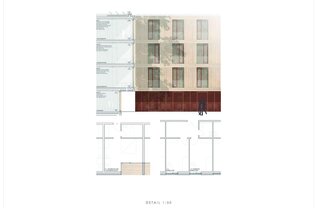
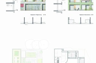
A classic solid construction with a perforated façade is proposed. The rear-ventilated clinker façade is structured by concrete elements in front. This promises economical maintenance, but the construction costs are likely to be higher than average. The façade is sound but does not create much of an identity.
The characteristic values of site occupancy ratio/floor area ratio are in the higher range compared to the other works. The area characteristic value of usable space/traffic area per occupant is close to the specified figure of approx. 49.9m2.
Open spaces: The architects generously tie in with the existing district in the north with a plaza area, which would, however, also have to integrate the access to the underground car park ramp - contrary to the layout in the tree protection area further to the east. The resulting location of the building mass in the south results in a reduced proportion of green space to the rear, which is questionable. In addition, some individual spaces without buffers are located on the square area. The location of the garden for dementia patients requires the compulsory implementation of the idea section of the men’s residential home, which is also viewed critically. The intensively greened and usable roof areas can partially compensate for the smaller garden area on the ground floor and also provide the residents of the upper floors with quicker access to the open space.
mt2 ARCHITEKTEN I STADTPLANER BDA, Nuremberg und Hackl Hofmann Landschaftsarchitekten, Eichstätt
The urban development approach presented is basically conceivable and leads to a low level of overbuilding on the site and a good connection of the open spaces to the nursing home and the residential building. The cafeteria, which is oriented towards the district, is correctly located and can thus lead to the desired communication. The organisation of the floors of the nursing home is unfortunately too cramped – especially in the corridors – and schematic. Interior qualities are missing. The design of the doublet does not correspond to the wishes of the users. The proposal to form the space between Brückenstraße and the building structure as an “esplanade” is lauded in principle, but the implementation remains unclear.
Bär Stadelmann Stöcker Architekten, Nuremberg and WGF Objekt Landschaftsarchitekten, Nuremberg
The compact design is basically conceivable in terms of urban development; the positioning and staggered height of the building structures is comprehensible. The cafeteria is difficult to find for external visitors. The interior organisation of the upper floors is sparse and basically correctly structured. The scarcity of corridors in the dementia groups means that the two groups can hardly be kept separate. The development of the residential building is lacking in quality, and the underground car park exit is incorrectly located. Apropos of the outdoor facilities, the proposal suffers from too little elaboration and is not sufficiently occupied in various areas – e.g. in the area of the entrance.
raum3 Massari + Partner Architekten, Nuremberg and Kaiser+Juritza+Partner Landschaftsarchitekten, Stuttgart
The proposal to move the building away from the intersection to the east and thus create a generously dimensioned forecourt under the existing trees is persuasive. As a consequence, however, the building moves too close to the men’s dormitory, and the open spaces proposed there cannot be managed due to the height situation. Ultimately, the complex turns away from the district adjoining it to the east. The cafeteria is correctly located, but the lifts are hard to find from the entrance. The terraces assigned to the inner courtyards are completely covered and suffer from the resulting lack of light. Unfortunately, how many storeys the participants propose for the residential building is not clearly presented.
Benkert Schäfer Architekten, Munich, H2M Architekten, Kulmbach and GTL Michael Triebswetter Landscape Architect, Kassel
The design, composed of five building structures, is not entirely satisfactory in terms of urban development. A clear address is missing, and the fact that three of the five building structures are joined together, thus preventing possible connections to the square space, is a source of criticism. The organisation is sprawling, the design of the square space with a garden for dementia patients and a café garden is not convincing. The built-up area is so large that a significant part of the landscape space of the tree population is destroyed.
meck architekten, Munich and lohrer hochrein landschaftsarchitekten, Munich
The jury was not convinced by the urban development of the design due to the large built-up area and the blocking effect of the nursing home. The planning of the open spaces is concentrated on the courtyards, with little being specified for the surrounding areas.
baum-Kappler architekten, Nuremberg and WLA Wengemuth Landschaftsarchitektur, Erfurt
The division of the building mass into three cube-shaped sections, which is conceivable in principle, leads to a large proportion of space and is therefore not economical. In particular, the development in the building structure for senior citizens’ housing obstructs a possible communication zone. The quality of the courtyard to the south of the cafeteria is questioned; the orientation of residents’ rooms to the open space appears to be unsuitable. The connection of the garden for dementia patients on the roof to the top floor via spiral staircases is unsuitable.
SRAP Architects, Nuremberg and Studio B Landscape Architecture, Munich
The work presents a clear urban development solution that is basically comprehensible, but lacks design qualities. The cafeteria is in the right place. On the upper floors, however, the interior organisation suffers from long, unlit corridors and has little interior quality. The value of usable space + traffic area / resident care is too high. Delivery is cramped, and the heights proposed in this area are difficult to manage.
Koczor Teuchert Lünz KTL Architekten, Rottweil and faktorgruen Landschaftsarchitekten, Rottweil
The positioning of the residential building adjacent to the intersection is conceivable in principle, but the resulting open space between the residential building and the nursing home is not elaborated in the design work from the space that is possible here. The design of the doublet rooms does not follow the wishes of the users. The façades cannot fulfil the design requirements expected at this location. The positioning of the western building edges leads to great losses in the existing greenery. In the design of the open spaces, the work remains schematic; further statements on the usability of the areas are wanting.
GEORG SCHEEL·WETZEL ARCHITEKTEN, Berlin and Planstatt Senner, Überlingen
The urban development approach presented and the design of the building structure are not convincing to the jury, even if the compactness presented is conceivable in principle. The open space in front of the entrance is cramped and unattractive. The cafeteria is turned away from public view, and the area is difficult to find for outsiders from the entrance. The facility suffers from functional deficiencies on the floors. The open-air design with its repetitive arch motifs seems inappropriate for the location.
Muck Petzet Architekten, Munich and el:ch Landschaftsarchitekten, Munich
The surprising approach with the large, ambitiously layered building structure does not suit this site, which is not characterised by inner-city density. Given this realisation, all further considerations on the organisation of the site represent noteworthy contributions to the task, but cannot override the basic problem. The statement that all residents live facing the terraces and the open spaces is only partially true. Many rooms are oriented to the west and have no contact with the open space proposed to the east. The design of the ground floor as an open parking area visible to Brückenstraße negates the possibilities of enlivening the public space at this location.

